Wagestream
We were bestowed with the honour of helping some of our friends in London to create this wonderful, successful company. Wagestream is an app, allowing employees to withdraw money they’ve already earnt. Currently serving 100,000 clients around the UK - and soon to be in other countries, we created their entire brand experience from start to finish. From app, to website, to branding and art direction + printed collateral. It’s been an almost 2-year long collaboration, and we’re happy that this experience is helping so many people be smarter about their money.
Tracking & history
The key to this feature within the app, was to break down complex information about users’ wage history in a simple, easy to digest way. Using simple infographics that don’t overwhelm, and showing information as the user scrolls through the time period.


Safestream
Sticking to our simple visual language, we created a feature that teaches people to save a little bit every month. We made the whole process visually entertaining, crystal clear and motivational - with one clear goal. Saving.


Knowledge base
One of the largest parts of financial wellbeing, is simply knowing your finances inside out. Financial products, how to save, how to handle money - to name a few. That’s exactly why we created a knowledge-base within the app that was regularly updated with articles, tips and other useful content. Each piece of content was built with the sole intent to educate people on how to be smarter and more confident with their financial decisions.


Intro
Tour

Custom 3D
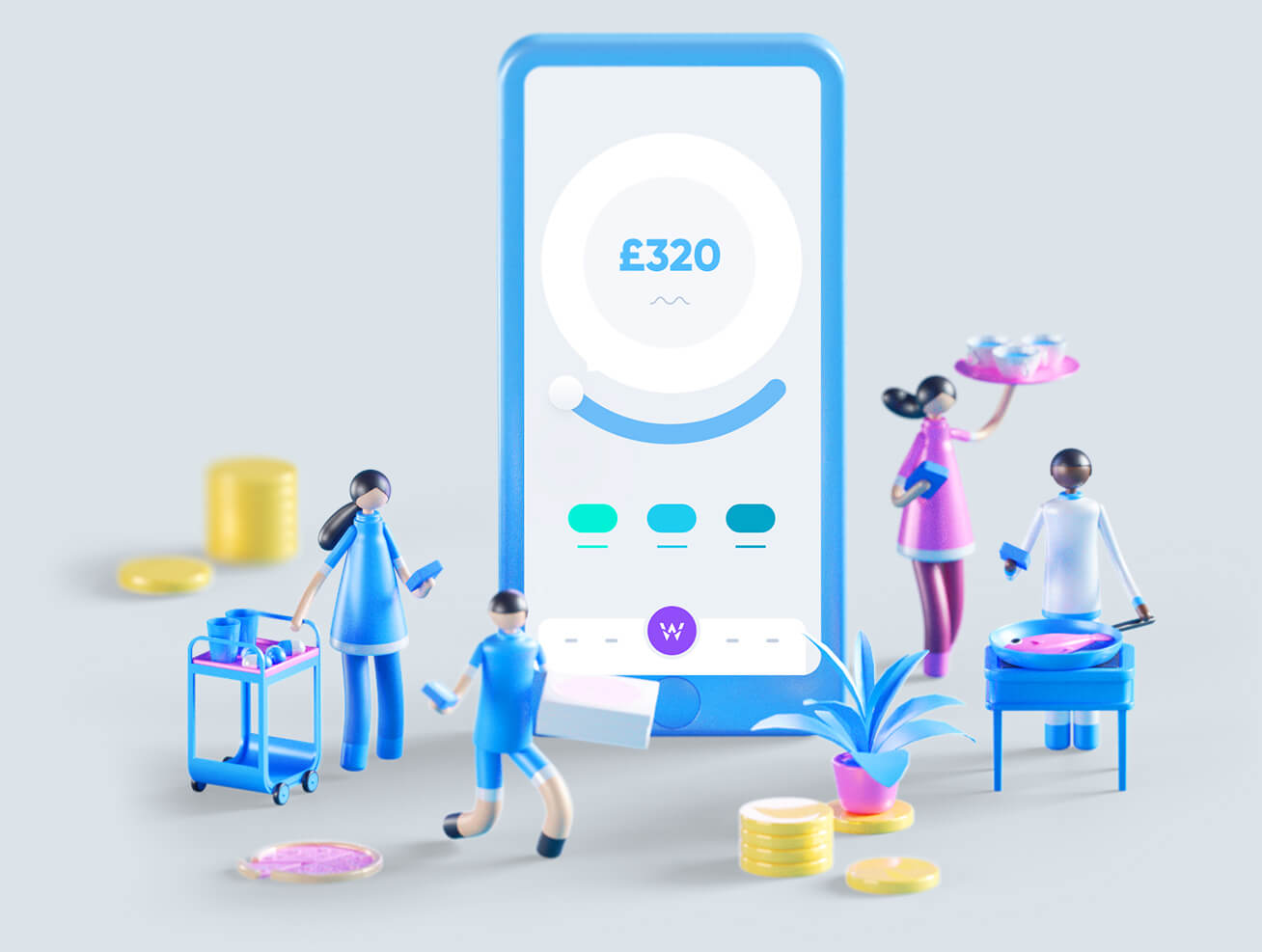
We created Wagestream’s visual style as a means of storytelling. To get rid of the stereotypical, financial aesthetic, and replace it with a more down-to-earth style that explained things in a human way - and complemented simple, clean graphics. In order to help our users understand exactly what we’re all about without bombarding them with information, we created cute, relatable 3D characters and environments.
made 3D
style
and social networks
ready for animations


Website
Alongside all the cute visuals, we helped create a robust, complex website that helped the Wagestream sales team drive traffic. What looks simple on the outside, consists of more than 50 landing pages, four language variations and 150 subpages depending on the audience the website is shown to depending on sophisticated analytics and user flow.
A big part of driving traffic to the website was creating a unified strategy. While the talented copywriters over at Wagestream thought up tons of useful blog content, our team helped with animations to catch potential customers attention.
/employers
/employees


Other materials
Not every conversation was held online. We created billboards, printed collateral and videos as well! Seeing as the financial world is so complicated, we wanted to simplify Wagestream’s message by conveying it through easy to understand infographics, with very strong visuals and clean layouts. We put a huge emphasis on this because we believe that when you truly understand your finances, you can be truly confident with your finances.

Presentations for meetings
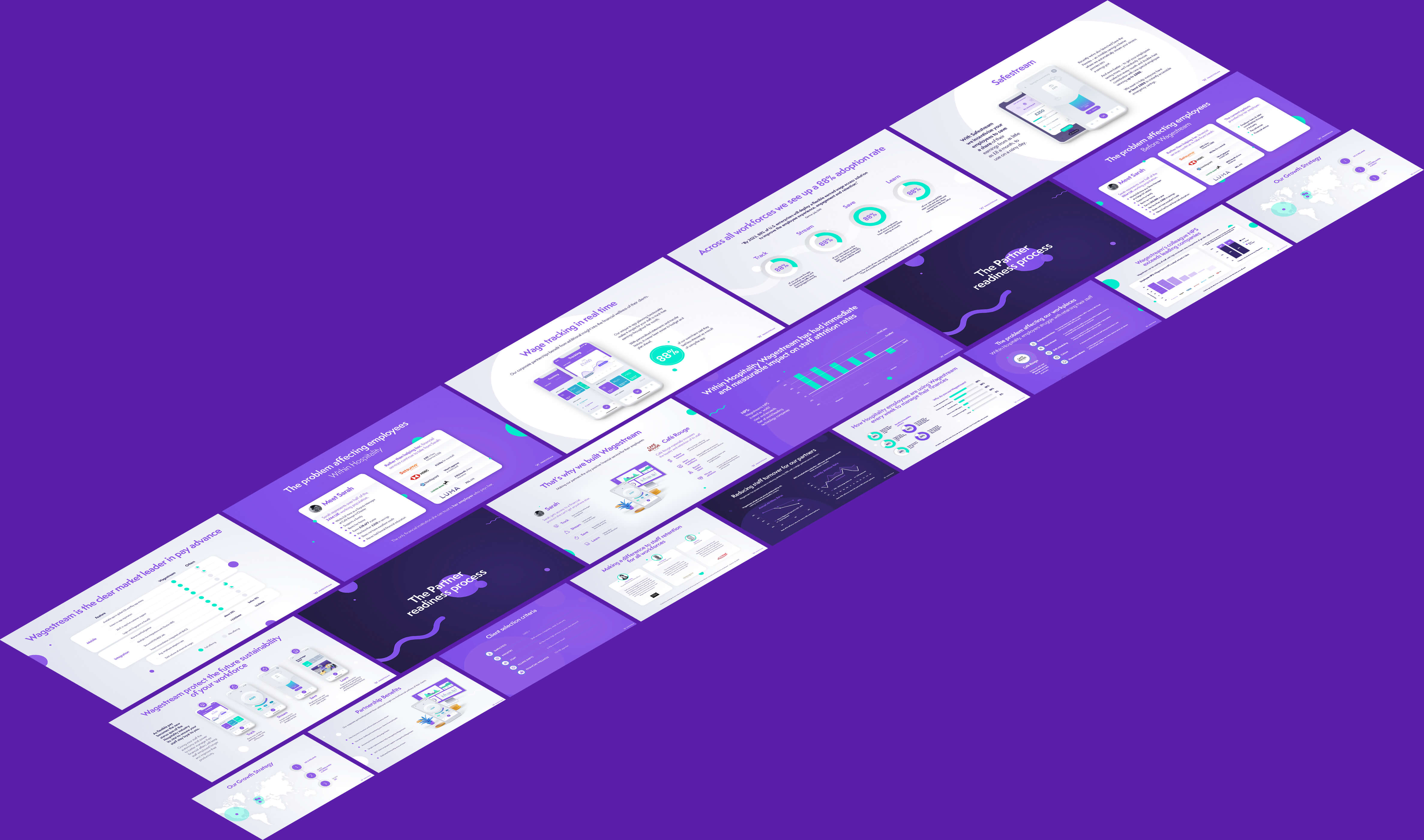
In the exact same way as we created the rest of our material, we created presentations for Wagestream to gain new clients. Clean and simple, with a focus on translating the most complicated of financial information, into foolproof infographics.


